Case Study: How We Helped motrparts.com Attract More Visitors Who Converted
Case Study: How We Helped motrparts.com Attract More Visitors Who Converted This is an SEO case study for auto parts…

Contact forms are quietly killing conversions on thousands of business websites — and most owners have no idea it’s happening. You’ve invested in a website, run ads, worked on SEO, and still the enquiries don’t come. Before you blame your traffic or your offer, look at your contact form. That small box sitting at the bottom of your page might be the exact reason people leave without reaching out.
This is one of the most overlooked conversion problems in digital marketing — and it’s fixable.
Table of Contents
A contact form becomes a conversion problem when it creates friction instead of removing it. Friction is anything that makes a visitor pause, second-guess, or give up. Too many fields, a vague headline, no trust signals, a generic submit button — each of these quietly pushes people away.
Most businesses treat the contact form as an afterthought. It gets added at the end of a web design project, uses default placeholder text, and never gets tested. But your contact form is often the last thing a potential client sees before they decide to reach out or move on. That makes it one of the most important elements on your entire site.
Asking for too much information upfront Name, email, phone, company name, budget, project type, how did you hear about us — it feels like a job application. Visitors who are still in the consideration stage aren’t ready to share all of that. Every extra field you add reduces the chance they’ll complete the form. Keep it to three fields maximum for first contact: name, email, and message.
Using a generic headline “Contact Us” tells visitors nothing. It doesn’t create urgency, it doesn’t reassure them, and it doesn’t tell them what happens next. A headline like “Tell Us About Your Project — We’ll Get Back to You Within 24 Hours” does all three.
No confirmation or next step After someone submits a form, what do they see? If it’s just a blank thank-you message, you’ve left them wondering whether anyone will actually respond. Set expectations clearly. Tell them when to expect a reply and what the process looks like.
Poor placement on the page If your contact form only lives on the Contact page, you’re making visitors work to find it. High-converting websites place enquiry forms or CTAs on service pages, the homepage, and sometimes even in blog posts — wherever intent is highest.
Search behaviour has changed. Google, AI tools like ChatGPT, and voice assistants now prioritise websites that answer questions clearly and guide users toward action. A cluttered or confusing contact form signals a poor user experience — and that affects how your site is ranked and recommended.
GEO (Generative Engine Optimisation) and AEO (Answer Engine Optimisation) both reward pages that are structured, direct, and user-first. If your contact page has no clear value statement, no trust signals, and no obvious next step, it won’t just lose you enquiries — it will hurt your overall digital presence.
Start with a form audit. Open your contact page as if you’re a first-time visitor. Ask yourself: Is it clear what happens after I submit? Do I trust this business enough to share my details? Is there anything making this feel like extra work?
Then make these changes: reduce your fields to the essentials, rewrite your headline to include a specific benefit or timeframe, add a line of reassurance below the form (“No spam. No sales calls. Just a conversation.”), and make sure your submit button says something action-oriented like “Send My Enquiry” instead of just “Submit.”
Test it. Track your form submissions in Google Analytics or your CRM. If your traffic is healthy but enquiries are low, your form is almost certainly part of the problem.
For first contact, three fields is the ideal number — name, email, and a message box. You can collect more details during the follow-up conversation.
Indirectly, yes. A poorly designed form increases bounce rate and reduces time on page, both of which affect how search engines evaluate your site’s quality.
It should tell visitors what they get and what happens next. Something like “Get a Free Consultation — We’ll Respond Within 24 Hours” works far better than a generic “Contact Us.”
Usually it’s friction — too many fields, vague messaging, or a lack of trust signals near the form. A quick audit of your contact page will usually reveal the issue.
At Turnihi Tech Solutions, we’ve seen this pattern repeatedly — businesses with solid traffic and strong services losing enquiries because of a contact form that was never designed to convert. Web design and digital marketing work together, and the contact form sits right at the intersection of both. If yours isn’t working, we can help you fix it. Reach out — through a form that actually works.
Share Post:

Related Post

Case Study: How We Helped motrparts.com Attract More Visitors Who Converted This is an SEO case study for auto parts…
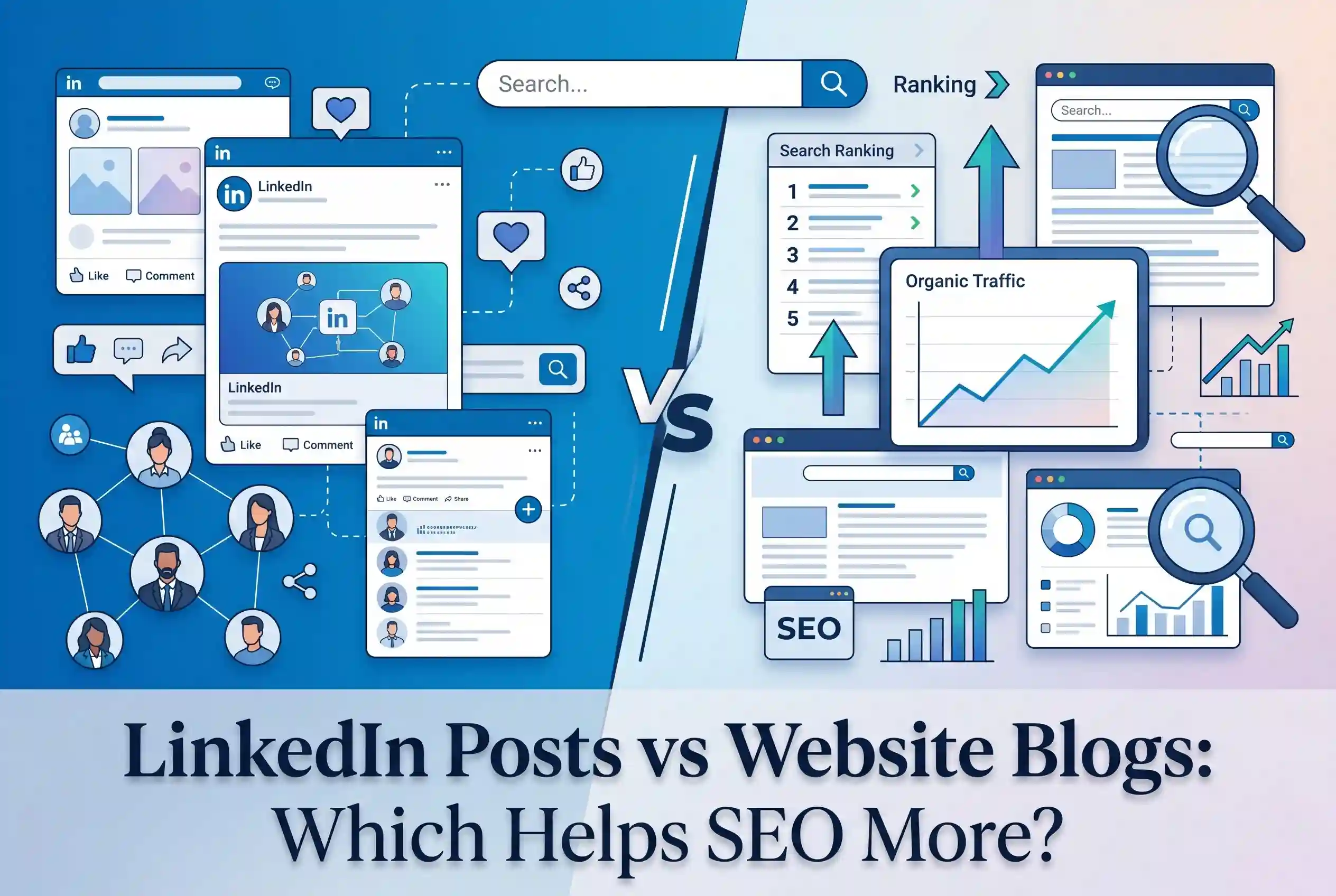
LinkedIn Posts vs Website Blogs: Which Helps SEO More? LinkedIn posts vs website blogs — this is a question more…

Why Your Google Ads Are Burning Budget Without Bringing in Business Google Ads can be one of the most powerful…
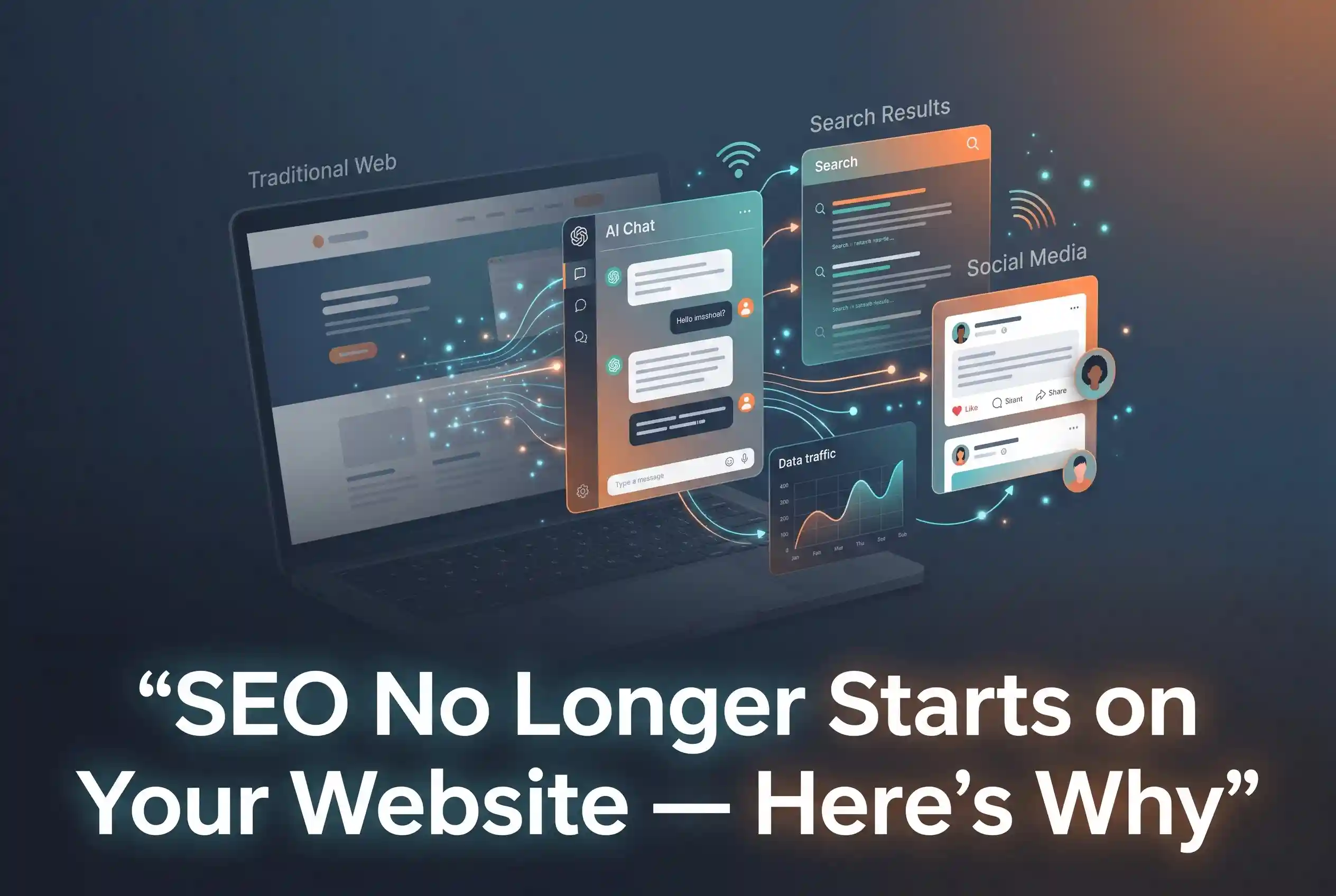
SEO No Longer Starts on Your Website – Here’s Why SEO in 2025 does not begin the moment someone lands…
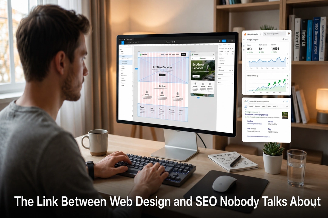
The Link Between Web Design and SEO Nobody Talks About Web design and SEO are not two separate strategies —…

Your Competitors Are Using AI In Digital Marketing. Are You Falling Behind? AI in digital marketing is no longer a…
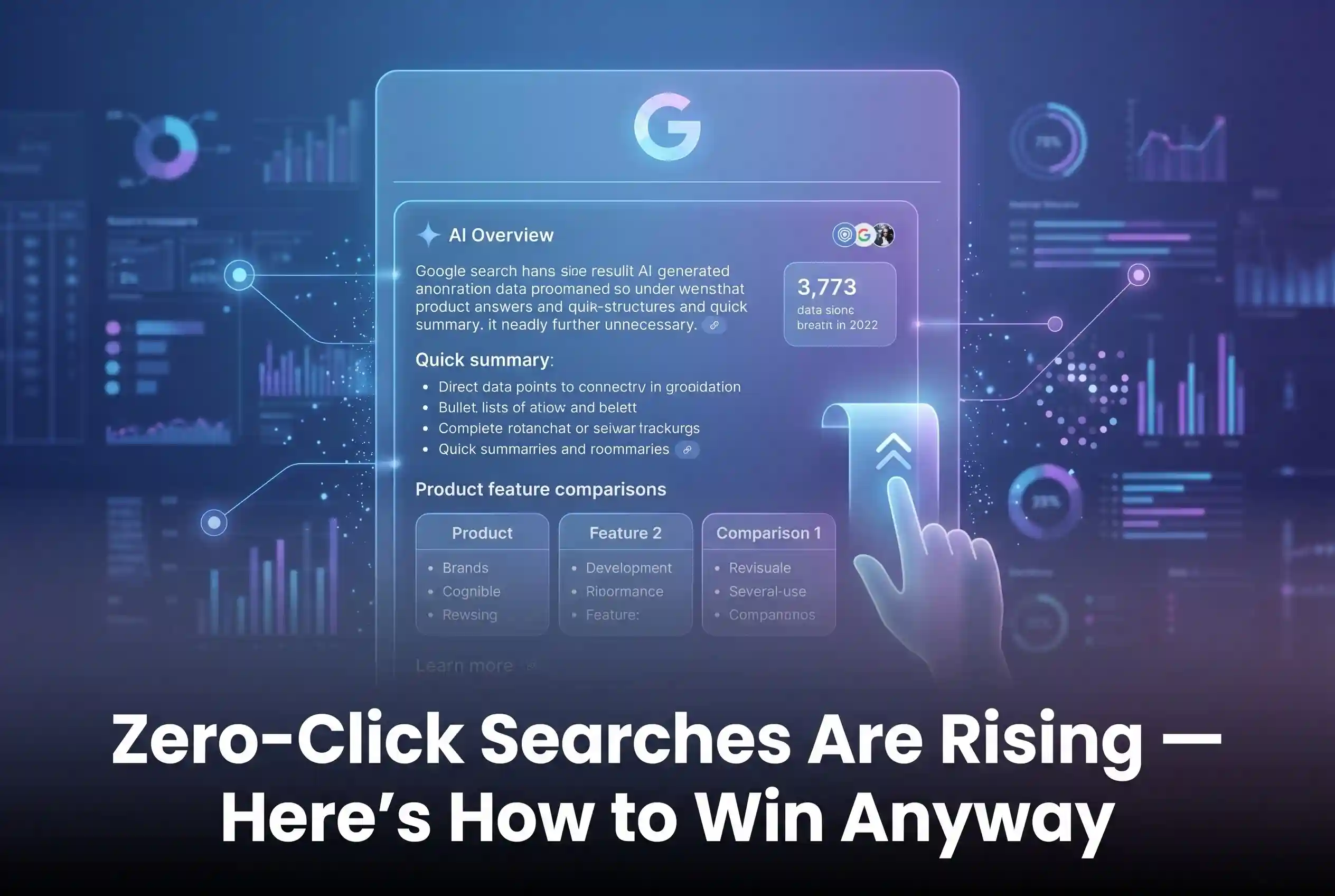
Zero-Click Searches Are Rising – Here’s How to Win Anyway Zero-click searches are fundamentally changing how we use the internet.…

Vibe Coding Is Over : Here’s What Actually Works Vibe coding had its moment. For a while, it felt like…

AI App Development Company vs Freelancers: What to Choose? Hiring an AI app development company gives you a full team,…
How to Use Claude as Your Marketing Assistant Claude is a free AI assistant built by Anthropic that helps businesses…

Web Design: Optimized for AI Search Web Design in 2026 is no longer just about visuals like colors and layouts;…
GEO Strategy: Rank in ChatGPT & Gemini Generative Engine Optimization (GEO) is the essential strategy of optimizing your brand to…